
Client: Chugach Mountain Bike Riders (CMBR)
Project: Logo refresh
Industry: Outdoor Recreation, Non-Profit
Services: Logo design, branding
Project: Logo refresh
Industry: Outdoor Recreation, Non-Profit
Services: Logo design, branding
Highlights: The CMBR logo is known statewide as the distinguishing mark of a lead entity in our MTB community. Through the consistent use of signage, digital media, and print material, the logo has become a highly recognizable emblem. This refresh keeps the core of CMBR’s identity while providing additional versatility for the different spaces CMBR has grown into.
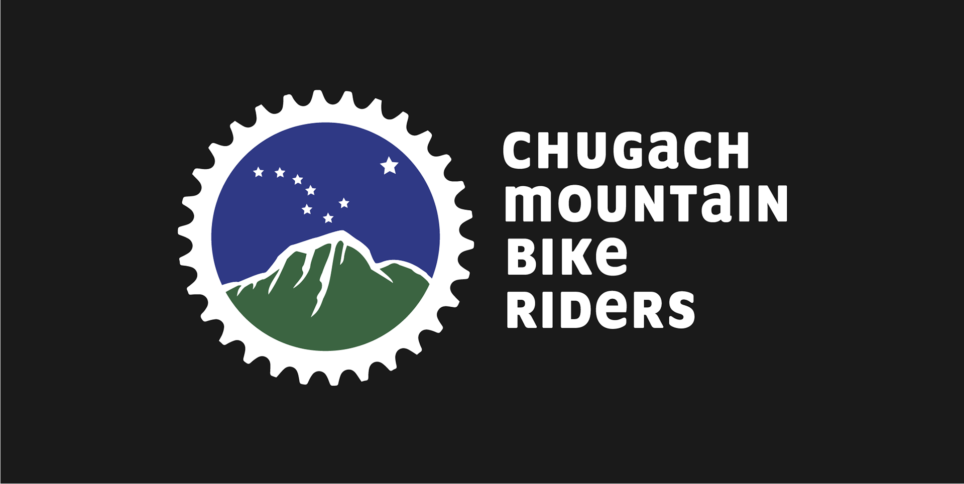
Colors: Lighter green and blue provide increased contrast with the black border, white stars, and mountain outline.
Artwork: The artwork retains brand equity through the iconic Bear Mountain. Simplified shapes and solid colors offer more opportunities for branding across materials like vinyl cuts, patches, and pins.
Artwork: The artwork retains brand equity through the iconic Bear Mountain. Simplified shapes and solid colors offer more opportunities for branding across materials like vinyl cuts, patches, and pins.
Chainring border: The chainring remains a distinctive shape that holds detail even at small sizes.
Typography: Updated typography provides a clean, professional wordmark with soft corners and a mix of upper and lowercase, balancing professionalism with playfulness. The stacked wordmark subtly reinforces CMBR’s name and acronym while being legible and scalable across print and digital formats.
Typography: Updated typography provides a clean, professional wordmark with soft corners and a mix of upper and lowercase, balancing professionalism with playfulness. The stacked wordmark subtly reinforces CMBR’s name and acronym while being legible and scalable across print and digital formats.
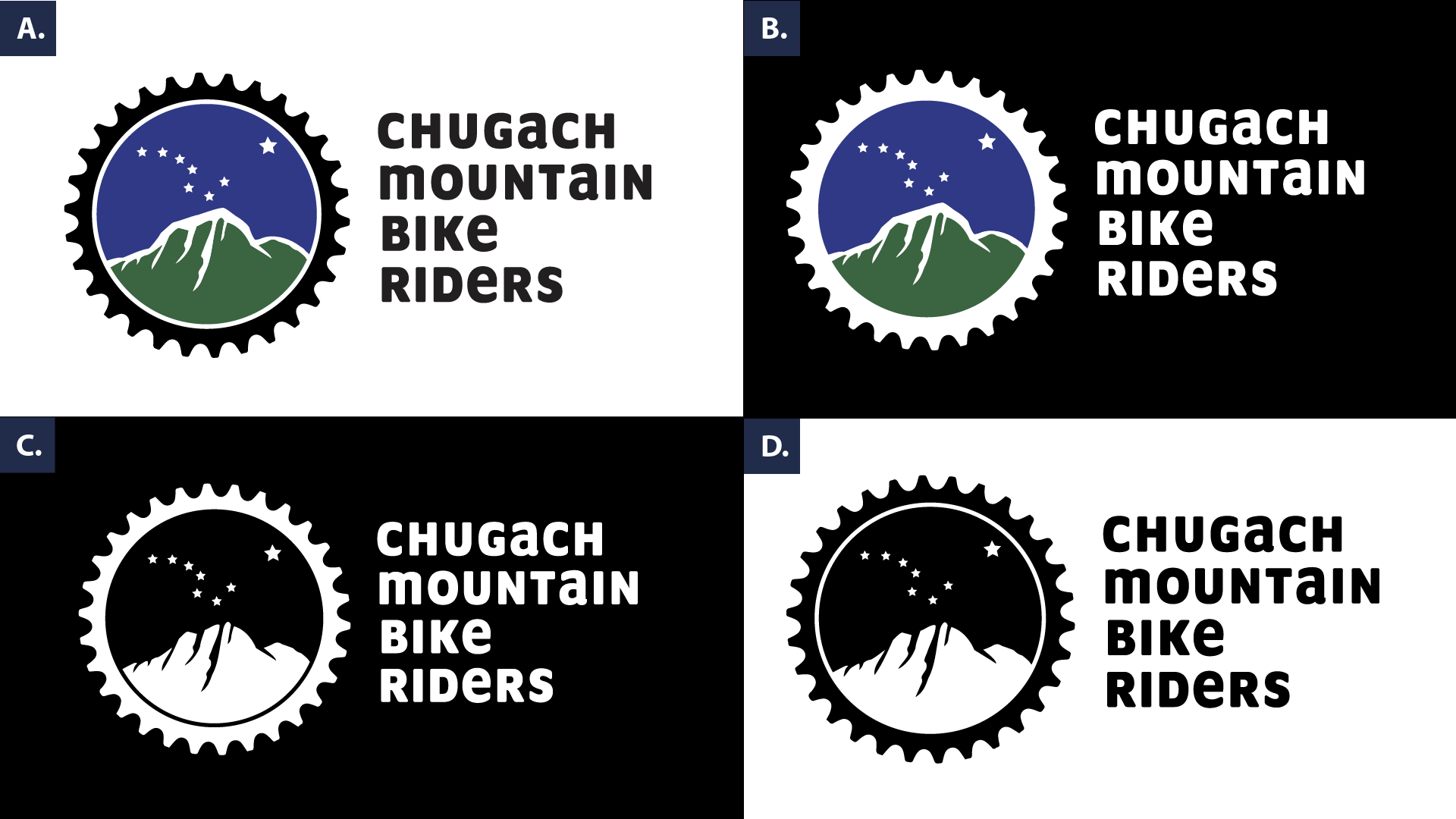
The simplified icon artwork and wordmark configurations allow for higher contrast on dark and light backgrounds. A. Primary logo, full color B. Primary logo reverse, three-color C. Primary logo reverse, 1-color D. Primary logo, 1-color

Scalable logo configurations allow the logo to remain legible at small sizes, addressing the limitations of the former logo.
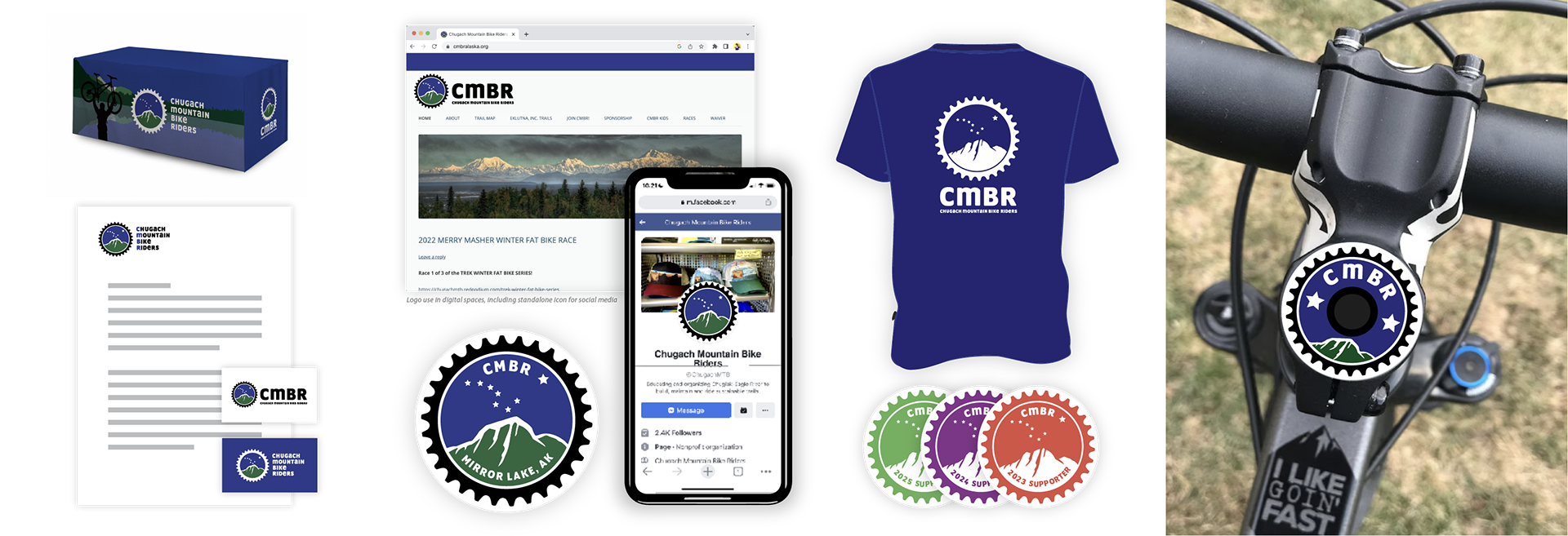
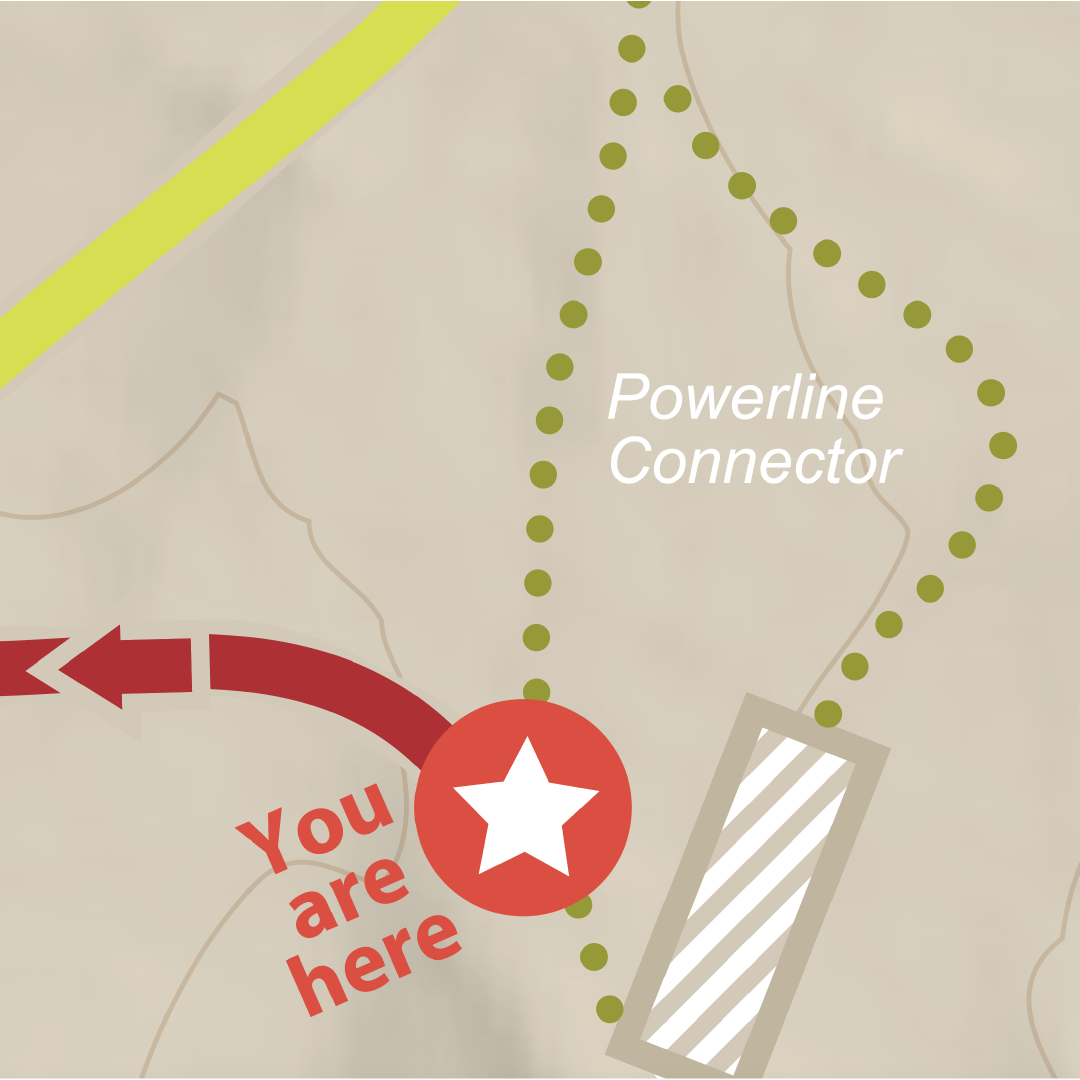
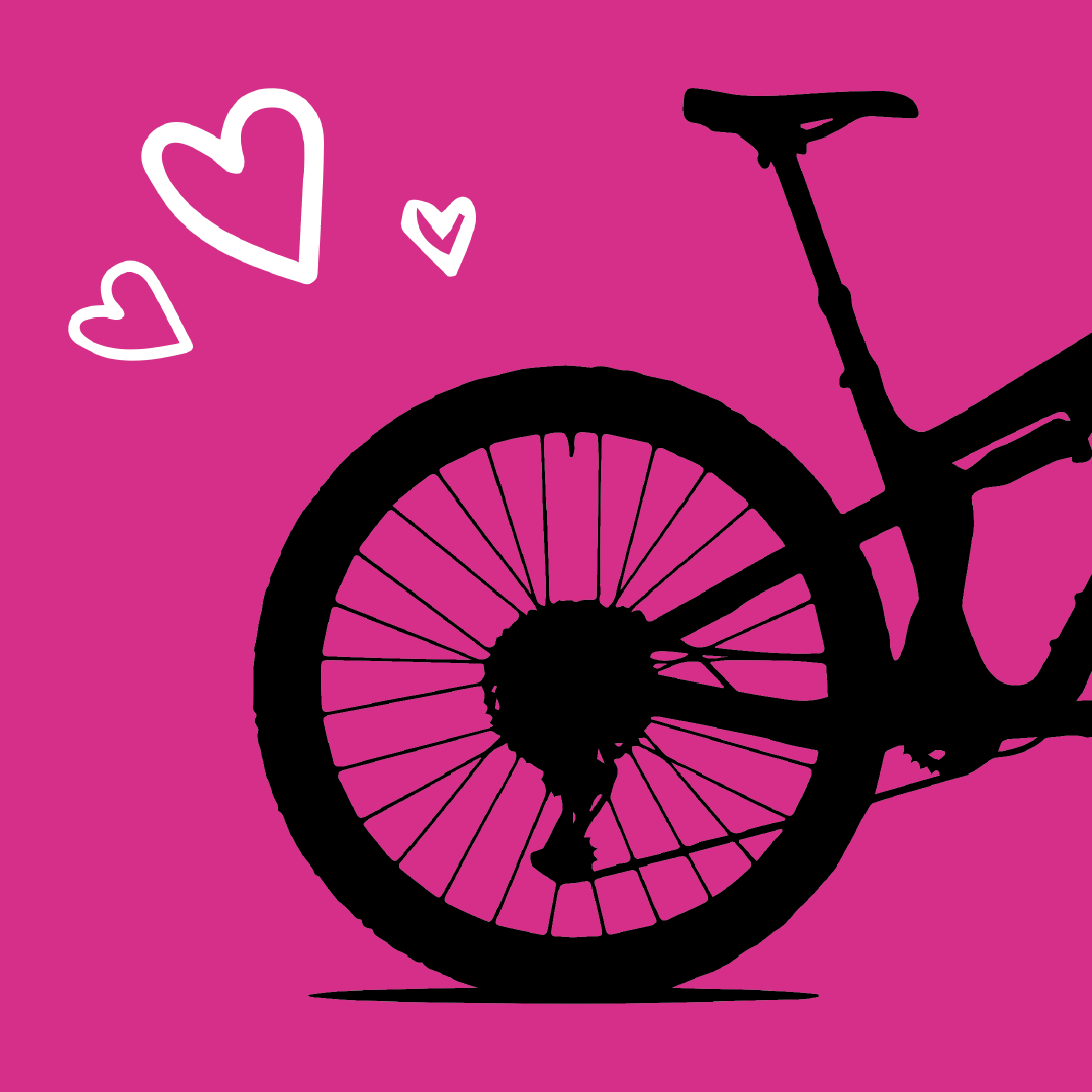
The refreshed logo opens up creative opportunities across a variety of uses, from merchandise to social media and companion programs. Standalone icons and pull-out wordmarks provide added versatility.